Logos are the visual ambassadors of brands, representing not only their identity but often carrying hidden messages and symbolism that engage the subconscious mind. In this blog, we’ll delve into the world of subliminal messages in logos, exploring five modern examples that employ clever cues to connect with audiences on a deeper, almost instinctual level.
-
FedEx: The Arrow of Progress

One of the most famous subliminal logos, FedEx’s emblem holds a hidden arrow between the “E” and the “x.” This arrow subtly communicates movement, speed, and precision – qualities integral to a reliable shipping company. This message resonates with customers on a subconscious level, solidifying FedEx’s reputation as a fast and efficient delivery service.
-
Amazon: From A to Z

Amazon’s logo is not just a smile; it’s also an arrow connecting the letter “a” to “z.” This subtly signifies that Amazon offers everything from A to Z, catering to a wide range of customer needs. The logo’s hidden message aligns with their extensive inventory and reinforces their commitment to being a one-stop shop for consumers.
-
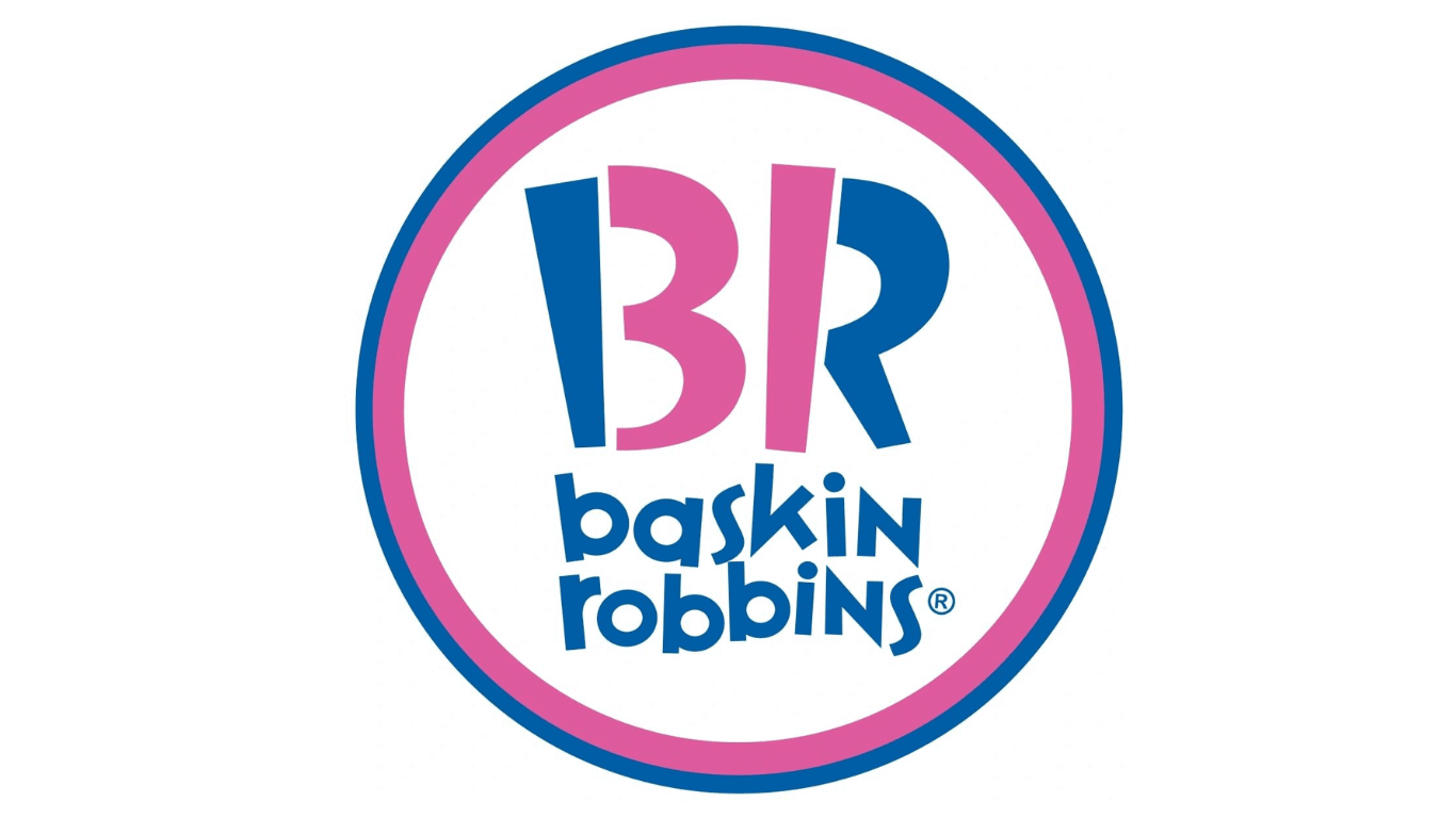
Baskin-Robbins: 31 Flavors

Baskin-Robbins, known for their variety of ice cream flavors, incorporates the number “31” within their logo. This hidden gem represents the 31 flavors they offer, a clever way of emphasizing their extensive selection while inviting customers to explore a world of choices.
-
Toblerone: The Swiss Alps

The Toblerone logo features a mountain symbol hidden within the Matterhorn mountain, representing the Swiss Alps where the chocolate is made. This subtle connection to the brand’s origins adds an emotional depth to the logo, making it resonate with both Swiss heritage and the quality of the product.
-
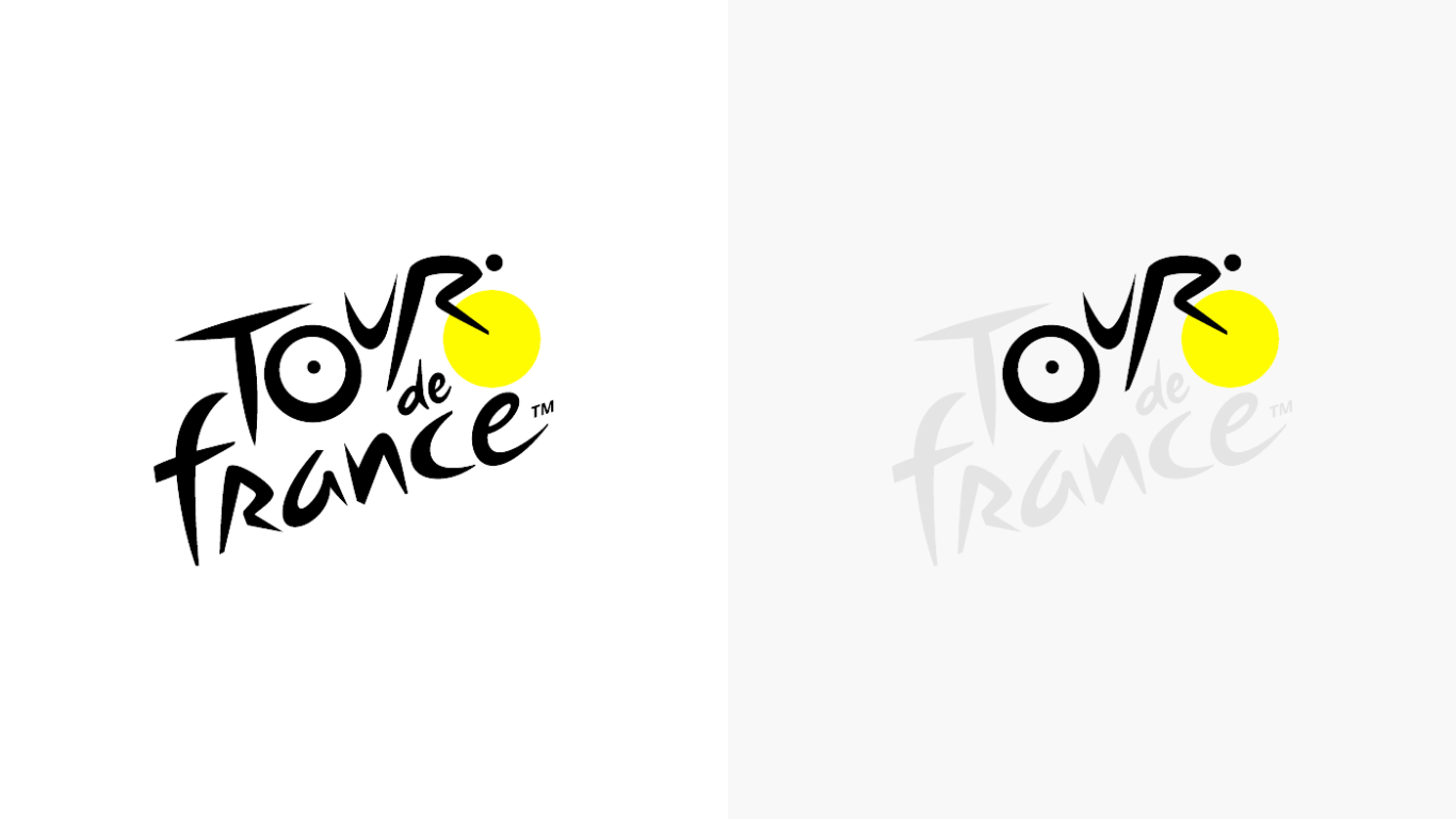
Tour de France: Cyclist Hidden in Text

The Tour de France logo conceals a cyclist within the letter “R” of “Tour.” This design subtly encapsulates the essence of the event – a race of cyclists. By integrating the athlete within the typography, the logo conveys movement and energy that echoes the dynamic spirit of the race.
Incorporating subliminal messages into logos is a strategic way for brands to establish deeper connections with their audiences. These hidden elements spark curiosity and leave a lasting impression on the subconscious, contributing to the overall brand experience. As you observe these logos and uncover their concealed messages, you’ll gain a new appreciation for the artistry behind these designs.
Remember, the next time you come across a logo, take a closer look – you might just uncover a world of hidden meaning.

